🚀 We've just released our new subscription model.

Check it out

Sustainable design
for mindful brands.

Dodonut brings your ideas to life using design. We care about delivering value to thoughtful brands that want to grow sustainably.

Trusted by

Removing 500kb from your website that is visited on average 20000 times monthly can save 1475.000g CO2

And it still can be functional, efficient and attract people.

This is the same as

Tree icon
0.7

planting trees

or

Cow icon
59.0g

of Eating beef

(25 kg CO2 per kg of beef)

or

Car icon
9.335

Driving Toyota Corolla for kilometers.

(158 g CO2 per km)

1 Dany Vankooten - Website Carbon Emmision

2 State of the web - average website size

Is this just about optimizing files?
Unfortunately, no.
(but that's a good start)

What's the process?

See our process

Ideation & Evaluation

During this phase, we gather information about your company. We want to learn about your business goals, target audience, unique value proposition, current state, and vision for future development.

Together with your team, we collect all the necessary data and meet your needs by conducting a workshop. As a result, we create a list of assumptions validated in the research phase. From the beginning, we search for possible sustainable solutions for your web presence and recommend them to you.

Key Outputs

  • Workshop insights
  • Proto-personas or personas
  • Competitors analysis
  • Web Analytics
  • Sustainable web design recommendations

What we did

Work usually speaks for itself, but our customers have voices too. Check some of the projects we shipped and what folks who worked with us say.

See all case studies
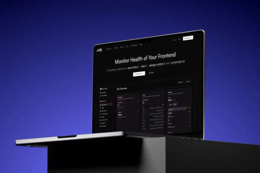
Mockup of Statsy presented on the laptop desktop

Statsy - Simplifying Web Performance Monitoring

Client
Statsy
Type
SaaS
Industries
Web performance monitoring
Services
UX Design, UI Design, Branding

Testimonials

Charm homepage

It was a pleasure working with Dodonut's design team to build Charm Industrial's carbon removal subscription and our carbon registry! They brought a keen attention to detail to our collaboration and it will result in a better experience for our customers.

Beebole homepage

The illustrations created by Zuza and Dodonut for our commercial website gave it a real soul. In a time where most websites use the same empty pictures, I am really happy to stand out with a much more personal design. We could also see a jump in the number of trials since the launch of the new website, so I am certainly not the only one to have been touched by Dodonut work.

Adek Industrial homepage

The team at Bejamas have been extremely responsive, detail-oriented, and a pleasure to work with. Every single question, comment, or concern that I had throughout the design process was addressed promptly and thoroughly. I'm completely thrilled about our new design, and I can't thank them enough for being such a professional and accommodating team.

Latest Articles

Discover ideas and insights from our journey to make the web greener and create better digital experiences.

See all 52 articles

Create website that works for both people and the planet.