Nucleus Cloud: Dark Mode UI & Illustration Redesign
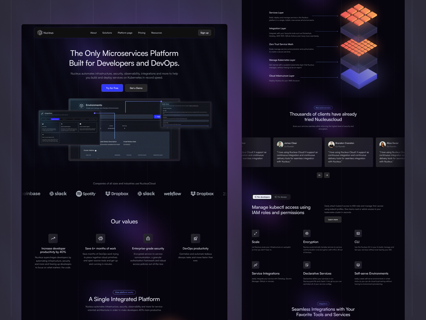
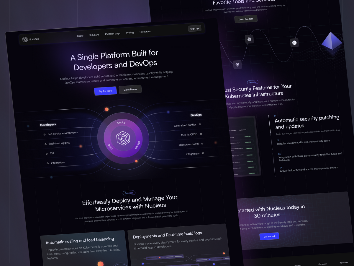
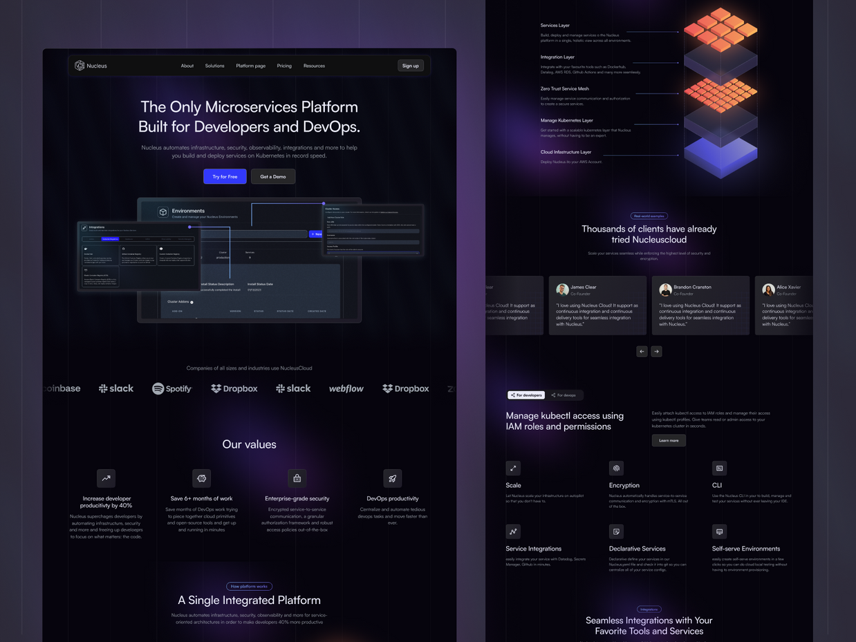
In a two-week timeline, we revitalized Nucleus Cloud's website with a dark mode UI and custom illustrations, improving user experience while effectively communicating their value proposition. This rapid redesign highlights our ability to deliver high-quality design solutions under tight deadlines.

- Client
- Nucleuscloud
- Type
- Web Design
- Industries
- Cloud Computing & Developer Tools
- Services
- UI Design, Illustrations
Introduction
Nucleus Cloud is a Kubernetes Developer Platform that helps Engineering teams deliver faster and with confidence by automating infrastructure, security, observability, integrations, and more. Their operations are based in San Francisco.
Despite the complexity and sophistication of their service, they found their existing website was not effectively communicating their value proposition to potential customers. It was in this context that our team was approached to refresh the Nucleus Cloud website.
The Challenge
Our client presented us with a challenging timeline – a full website refresh in just two weeks. Furthermore, the customer had already established a high-level concept of the layout for each page. They wanted to keep the structure mostly as on the previous website but needed a fresh design to enhance the overall user experience.
Our Role
Our role was to work with Nucleus Cloud to refine their website, ensuring it effectively communicated their brand, values, and offerings to their target audience.
Our services included:
- Wireframes: We started by creating wireframes for each page based on the provided layout concepts. This allowed us to quickly iterate on the design and structure of each page and ensure that the layout was optimized for usability.
- UI Design: With the wireframes as our blueprint, we then proceeded to the UI design phase. Our goal was to create an intuitive, visually pleasing interface that would enhance user engagement and increase conversions.
- Illustrations: During the UI design phase, we realized that the customer also needed illustrations on their page. We believe that illustrations can add a personal touch and make complex concepts more understandable, so we incorporated this into our design.
The Process
Wireframing
We started with wireframing, a crucial step in the website design process that allowed us to define the information hierarchy of the design, making it easier for the client to understand the layout concepts. Working collaboratively with the Nucleus team, we fine-tuned these wireframes, ensuring the website's structure was user-friendly and the copy was polished.
UI Design
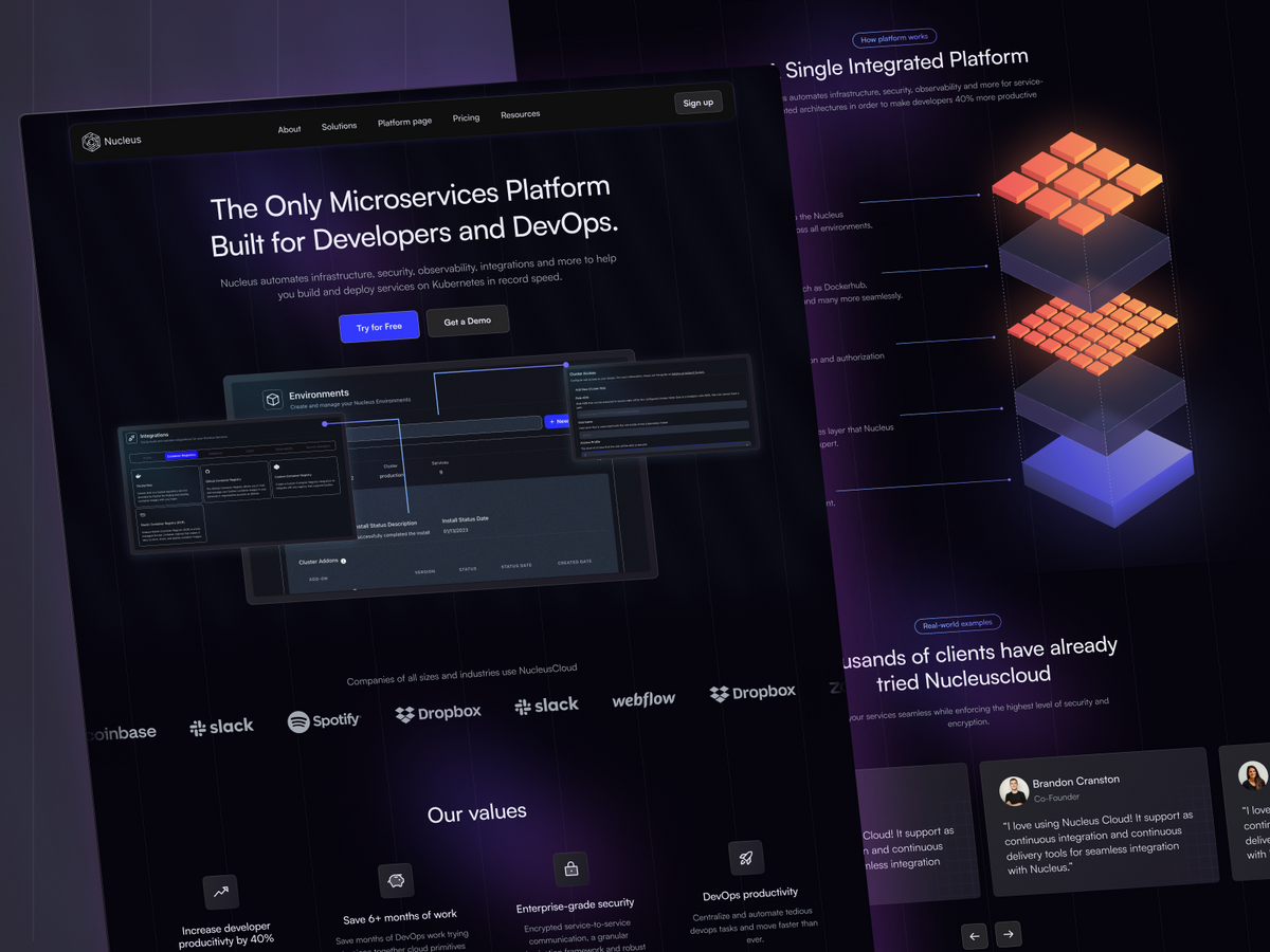
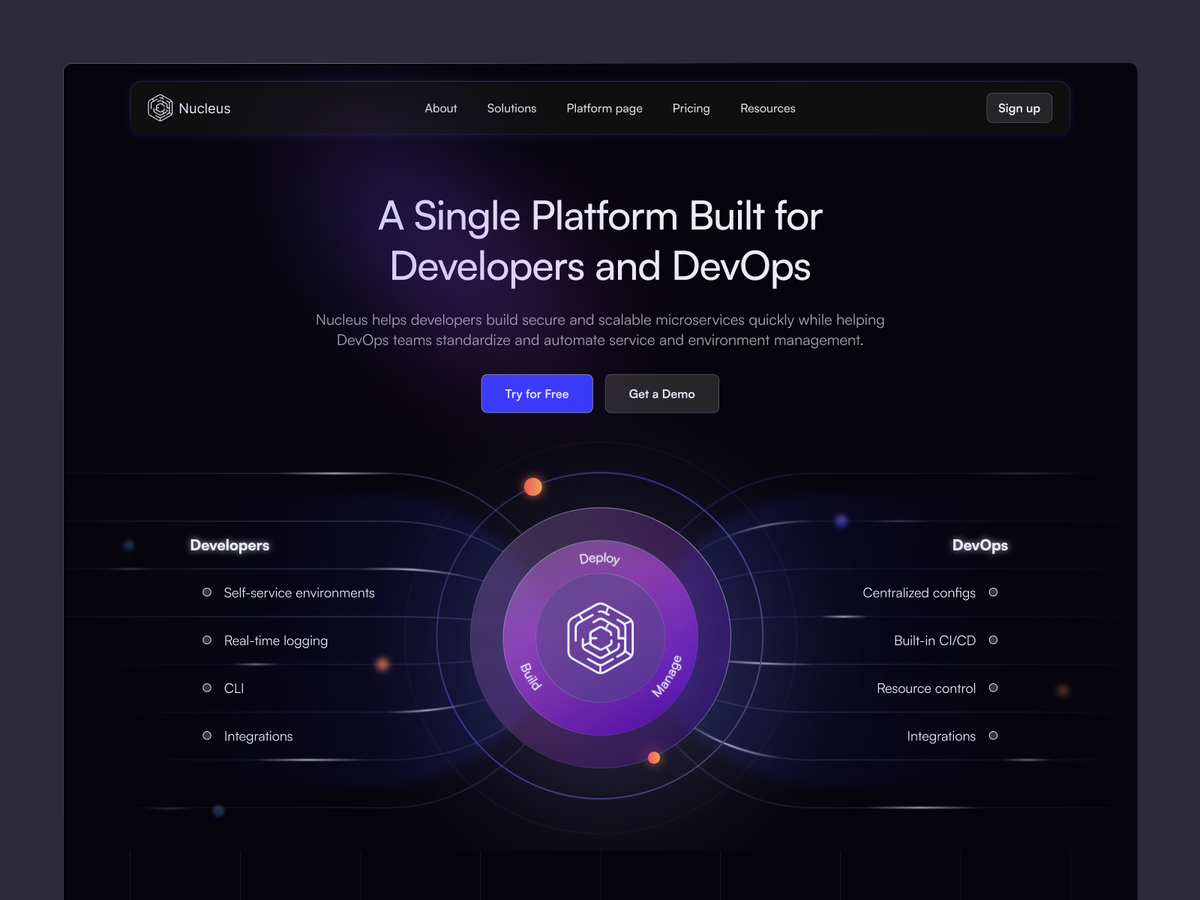
Next, we dove into the UI design, bringing the wireframes to life with color, typography, and imagery. Our aim was to create an engaging and intuitive interface that would communicate Nucleus's sophisticated offerings in a clear and compelling way.
Illustrations
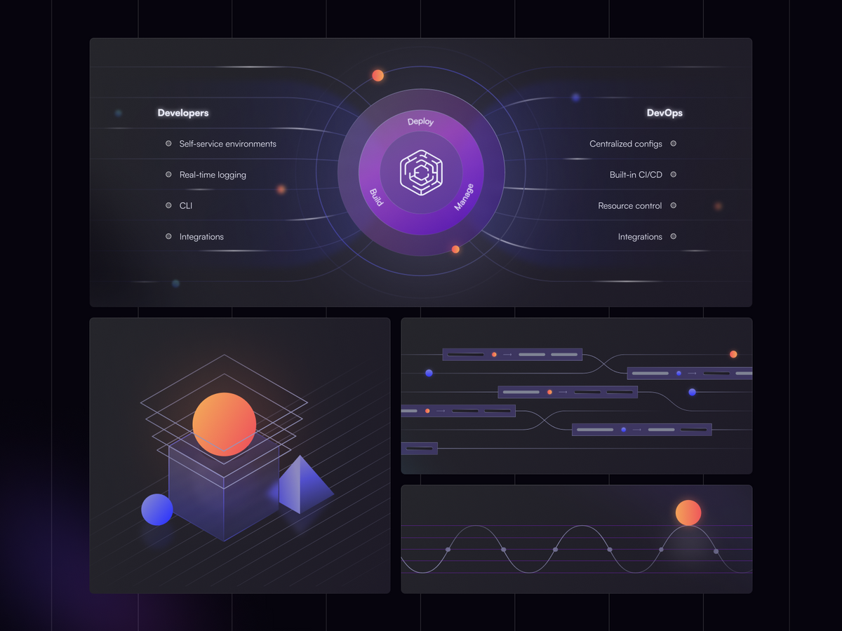
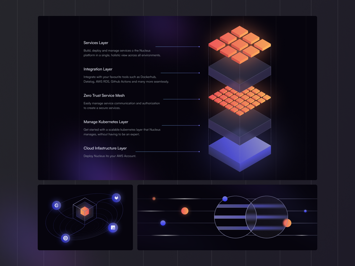
As we progressed with the UI design, we identified the need for illustrations to enhance the visual appeal of the website and aid in conveying complex concepts. We promptly addressed this need, designing custom illustrations that added a unique touch and boosted the overall user experience.
Conclusion
Despite the tight timeline, we were able to deliver a refreshed website that met the client's needs and expectations. The redesigned website not only communicates Nucleus's value proposition effectively but also provides an enhanced user experience through an intuitive UI design and engaging illustrations.
This project underscores our ability to work under tight deadlines and deliver high-quality design solutions. We are proud to have partnered with Nucleus Cloud on this project and look forward to future collaborations.
