🚀 We've just released our new subscription model.

Check it out

Our process. Dodo it right.

Across the whole process, we also have universal values for cooperation. Find out what is important to us when we cooperate with a company in creating a new digital product:

No matter where we are in the process, it is a good time for iteration! There is no status quo. When there are such needs, let's improve something.

Tools we use:

Dodo universal process

Whether you have your perfect flow or want to trust Dodo frames, we find out all projects have similar stages.

01 - Ideation & Evaluation

There is no active cooperation without deep knowledge of each other. Therefore we start every project by understanding the background of your business, your goals, target groups, and the vision for future development.

Desk Research

Desk research entails gathering existing data from inside and outside the company. It consists of previous projects and maps like customer journey maps, service blueprints, or workshops (design thinking, discovery).

We also focus on sources outside the company like internet searches, previously available surveys from related fields - we always pick the best source that follows company needs and prepare us for the cooperation.

Kick-off online workshop

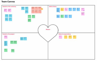
We meet together in an online, whole-day kick-off workshop to ask many questions and get even more answers. We are going through this meeting using several methodologies and tools like Team Canvas, Lean Canvas, Unique Value Proposition Canvas (UVP), Proto-Personas, Personas, etc. Usually, we cover stakeholders' points of view on these topics:

  • Competitors and alternatives
  • Target group & Proto-personas
  • Essential metrics like the type of conversion and SEO approach
  • Unique value proposition
  • Channels
  • Customer Journey Map

During the workshop, we also prioritize tasks and goals for the project, and we set up communication in the form of updates, status call frequency, and individual Slack channels.

Tools we use:

  • Miro
  • Figma
  • Butter
  • Hangout
  • Microsoft Teams
  • Zoom

Sustainability

We begin projects with reflection on making the website as environmentally friendly as possible. In the first phase, we analyze your existing product. We check current metrics and the project scale to understand what we can achieve with the new design and how the impact on the environment will change.

Through discussion, we determine what we want to achieve from a brand perspective. We also establish goals that indicate how far we want to go in particular cases regarding sustainability.

Finally, we consider design systems and open source solutions that we can use in the upcoming project. We set up an Agile process for the whole project that helps us avoid waste.

Phase 1 - Key outputs
Workshop insights

Workshop insights

See example
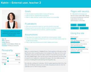
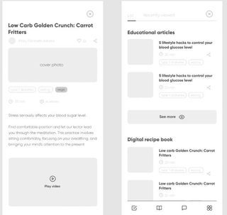
Proto-personas or personas

Proto-personas or personas

See example

02 - Discovery & Research

At Dodonut, we understand the challenges of creating a new website or other digital experiences. Our goal is to find a point of contact that meets all of your stakeholders' needs in the most efficient way possible.

We do this through quantitative and qualitative research methods that help us revise assumptions and validate them into factual statements. We then use this information to understand what we've learned by identifying trends and patterns among our findings. Those insights allow us to define your product's direction moving forward.

Analysis

After the workshop, we analyze what we already know from achievable sources like web analytics and entry and desk research. Collected data helps us create a list of assumptions that we will validate later. At this stage, you can suspect:

  • Competitor analysis
  • Web Analytics - Google Analytics, HotJar, Mixpanel

Tools we use:

  • Fullstory
  • HotJar
  • Mixpanel
  • Google Analytics
  • +other metrics

Research

In product discovery, research is always a core to finding an answer and confirming our assumptions. There is no space for guessing. We have to be sure that the proposed solutions will work well, respond to the client's needs, attract new users, and make others loyal to your brand and offer.

Qualitative research

Qualitative UX research methods offer a rich understanding of individual users, focused on the user's direct experience and human behavior. In web design, it serves us, for instance, to find out why users do what they do and what motivates them to complete a particular task. For qualitative research, we design a scenario for an external interview or focus group (e.g., with a potential target group and individual users). Properly asking questions can help us validate what we suspect or guess to ensure that design solutions will work. We use methods like:

  • In-depth Interviews (IDI)
  • Focus group
  • Usability testing
  • Discovery workshop

Tools we use:

  • Notion
  • Hangout
  • Zoom
  • Figma
  • paper, pen

Quantitative research

We use quantitative research to gain insights into our user's expectations and understand their behavior as they interact with the website. We ask questions that can be answered with numbers (quantitative data) and analyze the results. We employ methods such as:

  • Surveys and questionnaires
  • Mouse heatmaps
  • Clicking tests
  • A/B testing

Tools we use:

  • Fullstory
  • Hotjar
  • Typeform
  • Google Form
  • Cux

UX Strategy

Based on the research results, we prepare a UX strategy that will give appropriate direction to designing and developing websites. UX strategy for the company consists:

  • Summary of Target group
  • Competition analysis
  • Persona or jobs-to-be-done (JTBD)
  • Unique value propositions (UVP)
  • Recommendations for the new website
  • The architecture of the new webpages
  • User Journey Map and User Flow

Sustainability

In the research phase, we start with setting up analytics and checking existing ones if you have already done it. Next, we conduct the benchmarking process to see how far your competitors went with sustainability and identify areas where you can improve.

Through the research, we define your user and their devices. It helps us establish the target audience and design the new product to become accessible and adjusted to your user needs and skills. We identify the longest user journey and try to simplify it, which makes the interface more intuitive.

At last, we prepare a plan for testing new designs and developing new features that will make it easier for you to become sustainable.

During the research phase, we also care that our activities in discovering and researching data are as sustainable as possible. For that reason, we use online tools for the research and prefer to conduct it remotely to reduce energy spent on travel.

Phase 2 - Key outputs

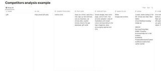
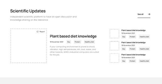
Competitors analysis

Competitors analysis

See example
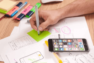
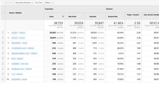
Web Analytics

Web Analytics

See example
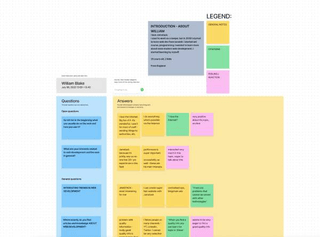
Interview insights

Interview insights

See example
Survey analysis

Survey analysis

Recommendations for the new webpage

Recommendations for the new webpage

Information architecture

Information architecture

See example

03 - UX Design

Once we know our target group and users, we know their goals, motivations, and problems, and we understand how to solve these problems with our product - it's time to start creating the website's skeleton.

Information Architecture & User flow

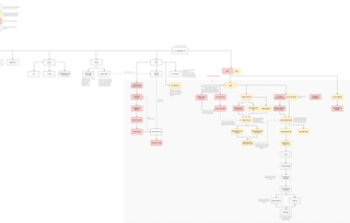
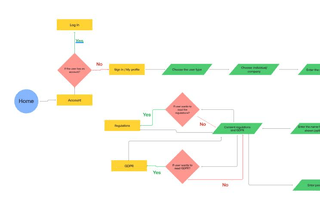
The information architecture is a diagram that visualizes how to arrange the content on the page. User flow, in turn, shows how users do a particular task through the designed interface.

We create a high-level structure of a website or application using simple diagrams. We also check the correctness of the User Stories listed before, verifying Success Stories and possible failure paths.

Tools we use:

  • Whimsical
  • Draw.io

Wireframes

Wireframes are low-fidelity, simplified outlines of the digital product. Designers use for them distinctive block layouts represented schematically with placeholders, buttons, image boxes, and text fields. The wireframe can give us a reliable view of the product without the need to spend time on details and possible changes to the website core.

Tools we use:

  • Miro
  • Figma

Prototypes

We can create a clickable interface based on implemented wireframes to show to stakeholders. Such a prototype can be run on any computer and check whether the project decisions have rational sense. We also check them during user and guerrilla tests. Such a prototype can also be used for research in the Product Discovery phase.

Tools we use:

  • Figma
  • Octopus
  • Whimsical

User testing

User testing is a critical component of the UX process. By testing our designs with users, we can ensure that they are intuitive and easy to use. When we have ready wireframes and prototypes, we always try them with users and other stakeholders. The goal of user testing is to get feedback about how easy or difficult it is to use the product and what they like or dislike about it. This information can help us improve our designs and make sure they match the needs and wants of real people.

Sustainability

In this phase, to perform a better experience and reduce the environmental impact, we focus on clear Information Architecture, so web visitors will easily find what they want. In creating wireframes, we eliminate dark and deceptive patterns that could mislead users and worsen the experience. Together with the marketing team, we also iterate on the content to adjust the scheme to users. At the end of the UX design phase, we also test the prototype even in the form of simple guerilla tests to avoid eventually waste in the UI design step.

Phase 3 - Key outputs

Wireframe for desktop

Wireframe for desktop

See example
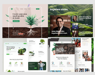
Wireframe for mobile

Wireframe for mobile

See example
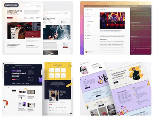
Prototype

Prototype

See example
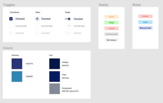
User flows

User flows

See example
User tests summary

User tests summary

04 - UI Design

UI design is a process in which we add muscles and a beautiful appearance to the previously built skeleton in wireframes. We focus here on how the website will look and its style, always keeping in mind its functionality, stakeholders' aim, and the best user experience. We create the visual version of the website via a few steps in this phase:

Moodboard

It's a collection of images, colors, shapes, and other materials used to communicate a particular design or project's visual style, voice, direction, and language. We treat it as an inspiration to develop our original website project.

Tools we use:

  • Figma
  • Dribbble

Branding

When your company also needs branding, we meet at a separate session where, during brainstorming, we create a map of brand associations. We propose a visual set of features for the company to develop a strong and positive brand perception.

Tools we use:

  • Adobe Illustrator

Illustrations

Along with branding, we often discuss visual strategies for your brand. Together with it, we create a set of illustrations for your brand.

Tools we use:

  • Adobe Illustrator
  • Procreate

Initial Design

After determining the moodboard, brand, and visual direction for your project, we can go to the first graphic views of your website or other digital product.

We start the graphic work by creating the first view. Together, we decide which page will be the first for which we will prepare a visual appearance. Usually, we design in two significantly different directions. After creating the proposal, we call the meeting where we discuss it.

Tools we use:

  • Figma

UI Design & Mockups

When we have approved the design, we create views for subsequent subpages. Based on the information architecture, we divide the work into the individual flow and smaller stages - usually weekly. Successively, we provide designed views based on wireframes.

Tools we use:

  • Figma

Styleguide & Design System

When we have a graphic design of the created product, it is worth taking care of its appropriate documentation for development and other designers who can develop the project.

We create a simple styleguide or a complex design system depending on the needs.

Tools we use:

  • Figma
  • Octopus
  • Whimsical

WCAG recommendations

We know how the issue of accessibility is essential to make a digital experience tailored to all users. Therefore we follow WCAG recommendations to ensure that our website will be usable and legible for everyone.

Sustainability

In the user interface (UI) phase, we also think about environmental aspects of web development. That's why we adjust the color scheme (we're aware that blue is a less effective color) and implement dark mode (yep—it's effective! here's why). We recommend variable fonts and consider their budget and overall consistency.

When possible, we use a ready library and an open source solution. We also implement JavaScript light solutions (e.g., we try to avoid carousels).

A picture is worth a thousand words, but in the case of sustainability, it can cost a lot of energy. Therefore we rethink the value and need of every visual content and use imagery efficiently. We always aim to use it in the most sustainable version, for example, in vector or webp format.

And finally, we love the clean design — white space means easier to navigate UI, which makes it more friendly in terms of UX and environmental impact.

Sustainability in the UI design phase means as well for us that we design experience that we optimize to work across devices and platforms.

Phase 4 - Key outputs

Moodboard

Moodboard

See example
UI design prototypes and mockups

UI design prototypes and mockups

See example
Styleguide

Styleguide

See example
WCAG recommendations

WCAG recommendations

User tests

User tests

05 - Development

Development is an integral part of the entire process, which helps our ideas come alive. We've been working with professional development since 2018 under the Bejamas brand. You can find more information on technologies and development approaches on their website:

At every stage of development, we aim to reduce your newly designed sustainable website's carbon emissions and energy consumption.

Sustainability

Sustainable web development uses tools and techniques that are not harmful to the environment. As many people may think, sustainability at this stage is not only about file optimization… but that’s a good start to think about it!

We deliver fast sites in a static approach of Jamstack, which allows us to optimize page weight carefully. In this phase, we care about images and font optimization. Our tracking script uses minimal processing power, and our page caching is optimized for optimal load times. We also maximize CPU usage by compressing our code, fonts, and images and preferably use more CSS than more energy-consuming JavaScript.

Finally, we use green hosting providers connected to renewable power generators.

Phase 5 - Key outputs

  • Jamstack website

  • Progessive Web App

  • Edge computing

  • Sustainable web development

and last but not least...

06 - Support and Growth

As Neville Brody once said, digital design is like painting, except the paint never dries. If you have created digital products before, you know that the release is just the beginning. With us, you can develop your product further from design stage to development. After product release, your company can always count on additional research, support, and verification of product UX.

  • Development maintenance
  • Application verification
  • Planning of sprints
  • Project development analysis
  • Roadmaps
  • Research & Discovery

Sustainability

Sustainability is not a finished product. It is a process. Technology, possibilities, and knowledge about it are constantly changing. Therefore, even after the launch of the website or app, we continuously search for improvement. That means we are together with you looking for the best solutions for diminishing the impact of the web on the environment, supporting you in growth and your positive force.

Agile diagram

Ready to make a positive impact?

Make a difference by joining ambitious brands.